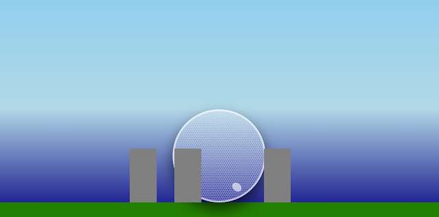
The Cinesphere at Ontario Place in Toronto is an architectural marvel, known for its geodesic dome structure. Replicating this iconic landmark with CSS poses a unique challenge due to its complex geometry. However, with a bit of creativity and a lot of CSS properties, we can create a simplified rendition that captures its essence.
Starting with the Basics
The journey begins with a basic HTML structure, setting the stage for our CSS art:
<div class="scene">
<div class="cinesphere"></div>
</div>{codeBox}
This clean structure is a canvas, waiting for styles to bring it to life. The .scene class sets a backdrop, mimicking the sky's expanse. The .cinesphere will become our focal point, a sphere that we'll dress in a pattern to suggest the complex facade of the Cinesphere.
Styling with CSS
Using CSS, we define the .scene to create a context for our Cinesphere, setting width, height, and a background color that serves as the sky.
Next, we bring attention to the .cinesphere. Here's where we flex our CSS muscles. We start by making it round with border-radius: 50% and give it a simple shadow to suggest depth. But the Cinesphere isn't just any sphere—it's a mesh of triangles. To mimic this, we use linear-gradient to create a pattern. The gradients intersect to form a diamond pattern that resembles the Cinesphere's triangular panels.
.cinesphere {
background-image:
linear-gradient(60deg, #fff 25%, transparent 25%, transparent 75%, #fff 75%, #fff),
linear-gradient(60deg, #fff 25%, transparent 25%, transparent 75%, #fff 75%, #fff),
linear-gradient(60deg, transparent 62.5%, #fff 62.5%, #fff 87.5%, transparent 87.5%),
linear-gradient(60deg, transparent 62.5%, #fff 62.5%, #fff 87.5%, transparent 87.5%);
background-size: 50px 86.6px;
background-position: 0 0, 0 0, 25px 43.3px, 25px 43.3px;
}{codeBox}
The background-size and background-position properties are finely tuned to align the patterns into a cohesive design.
Reflections and Realism
The real Cinesphere sits by the water, offering a stunning reflection. While CSS can't mirror reality, we can use opacity and transform: scaleY(-1) to create a reflection-like effect, enhancing the realism of our portrayal.
Limitations and Possibilities
While CSS is powerful, there are limits to its capabilities for rendering intricate architectural structures. The complexity of the Cinesphere's design requires simplification. Yet, this exercise demonstrates the potential of CSS to create recognizable forms and stimulate the imagination, bridging the gap between web design and art.
Here is the full CSS, a work in progress.
.ontario-place {
position: relative;
width: 500px;
height: 250px;
background-color: lightblue; /* General background */
}
.sky {
position: absolute;
top: 0;
width: 100%;
height: 50%;
background: linear-gradient(to bottom, skyblue, lightblue);
}
.water {
position: absolute;
bottom: 0;
width: 100%;
height: 50%;
background: linear-gradient(to top, navy, lightblue);
}
.landscape {
position: absolute;
bottom: 0;
width: 100%;
height: 20px;
background-color: green;
}
.cinesphere {
position: absolute;
bottom: 20px; /* Adjusted for landscape height */
left: 50%;
transform: translateX(-50%);
width: 100px;
height: 100px;
background: linear-gradient(
145deg,
silver 0%,
lightgray 40%,
darkgray 60%,
silver 100%
); /* Metallic gradient */
border-radius: 50%;
box-shadow: 0 8px 15px rgba(0, 0, 0, 0.6); /* Deeper shadow for 3D effect */
border: 2px solid rgba(255, 255, 255, 0.6); /* Subtle reflective border */
overflow: hidden; /* Ensures pseudo-elements don't escape the circle */
background-image: repeating-linear-gradient(
0deg,
transparent,
transparent 1px,
rgba(255, 255, 255, 0.2) 1px,
rgba(255, 255, 255, 0.2) 2px
), repeating-linear-gradient(
60deg,
transparent,
transparent 1px,
rgba(255, 255, 255, 0.2) 1px,
rgba(255, 255, 255, 0.2) 2px
), repeating-linear-gradient(
120deg,
transparent,
transparent 1px,
rgba(255, 255, 255, 0.2) 1px,
rgba(255, 255, 255, 0.2) 2px
);
}
}
.cinesphere::before {
content: '';
position: absolute;
top: 10%;
left: 25%;
width: 20%;
height: 20%;
background-color: rgba(255, 255, 255, 0.8);
border-radius: 50%;
transform: skewX(-15deg); /* Slight skew for an elliptical reflection */
box-shadow: 0 0 15px 5px rgba(255, 255, 255, 0.5); /* Glare effect */
}
.cinesphere::after {
content: '';
position: absolute;
bottom: 10%;
right: 25%;
width: 10%;
height: 10%;
background-color: rgba(255, 255, 255, 0.6);
border-radius: 50%;
transform: skewX(15deg); /* Opposite skew for another reflection */
}
.building {
position: absolute;
bottom: 20px; /* Same as landscape height */
width: 30px;
height: 60px;
background-color: gray;
}
.building1 {
left: 30%;
}
.building2 {
left: 40%;
}
.building3 {
left: 60%;
}
.reflection {
/* Styles to invert and fade the cinesphere for a reflection effect */
position: absolute;
bottom: -120px; /* Adjust this value to where the water's surface would be */
left: 50%;
transform: translateX(-50%) scaleY(-1);
width: 100px;
height: 100px;
opacity: 0.5; /* Make the reflection less opaque than the object */
background-image: /* Same background styles as .cinesphere */;
/* More styles to add blur and fading effect */
filter: blur(2px);
}{codeBox}


0 Comments